Tuesday, 13 November 2012

Dean - game Contribution

This is a wrap up of all my contributions to the game.

The following sea assets were modelled, UVed, and textured by me.
 The Sea urchin hasn't changed much at all except that now it has a Normal map. There were problems with the animation, however Matt managed to fix this.

Clam, hasn't changed since it was completed.
 Treasure chest with gold.
 Octopus in chest.

Octopus with animation.


After finishing my underwater assets, Matt needed some more stuff for the fields level.

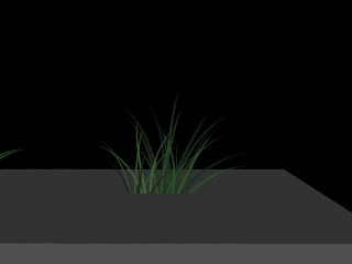
Various types of grass that I made. Props to Josh for animating them.


Scattered rocks modelled, UVed and textured by me.

 Close-up of rock.


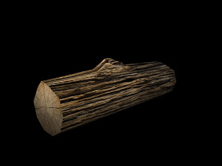
 Log mod.elled, UVed and textured by me.
 Streams of mist that I made in Photoshop and placed on a plane. Each strip is a separate object.
 I UV unwrapped the bed, pillow, mattress, and blanket and also textured them. The blanket is a simple shape that had cloth simulation, which was then baked to keep it in place. I had trouble with baking the cloth simulation, but thanks to Matt, Natasha and Darren, it was accomplished.
 Different position of the blanket for after Xavier wakes up.
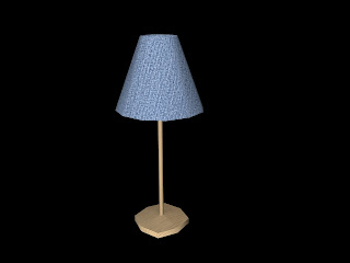
 Lamp for the bedroom that I UVed and textured.
 The bedroom needed a floor obviously, so I made blue-grey carpet.
Walls were needed too.

I also fixed up the normal map for James' tractor.

Each of my objects were exported into unity packages myself. Props to Matt for showing me how to do so.

Sunday, 11 November 2012

Charles - Contributions to Game

As well as working on hatchet man, I was assigned to unwrap and texture many of the assets for Matt's "Plains" level: 


The cave texture worked well except when some parts were shown close to the camera. To remedy this, I broke the UVs at the front off and scaled them up. There is a seam but because it's obscured by rocks, it works, and the foreground is less pixelated where it's seen.


The "cave bin".


The bridge in the cave.


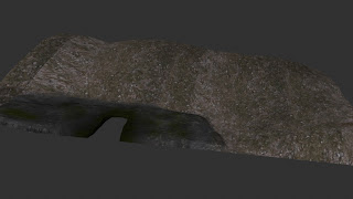
The "cave cap". Had similar problems to the cave texture, only more extreme. A lot was seen up close. The solution we ended up choosing was to break the mesh into two parts and give each of those parts 4096*4096 textures. I stretched and compressed the UVs where necessary - in Unity I saw the left side of the mesh is never seen in game, so quality is really low/compressed there. In other parts, the UVs are larger to capture more detail. There are also trees growing out of the stone, which is a bit weird, but after talking to Matt about it and testing it in Unity, the area is typically to blurred by the camera, or obscured by other assets, for the player to see this.


The "cave lift" was a pain to unwrap until I realised I could just unwrap one of each component and duplicate them several times. Effectively remodelling the whole thing, but so much easier than trying to unwrap it as it was.


Just a plank. Nothing to see here. I had to tone down the saturation because it matched the colour of the ground too much.


The pylons for the cave. Originally all the same colour and tone, but I thought altering the vertical parts would make it stand out too much if we were using the same mesh several times. To make repetition less obvious the tone is the same on the vertical planks, but the horizontal and diagonal parts are different.


Originally part of a separate project, Matt wanted to put this house in somewhere on his level. I'm not sure if he did but I still had to re-name, re-align and prepare everything for an export into Unity.


Just a brick. The last I heard was that it probably wasn't going to be used.


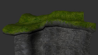
The cliff. At this point in the game, I decided it would be cool if the grass got more lush and generally inviting, the higher the player climbed, seeing as the floating islands that lead the player to it had similar grass. 


The terrain below the cliff. You can see the grass and dirt is different - rougher, eventually meeting solid stone.


Part of the fence. Matt specifically wanted mossy things growing on it, so I overlayed / multiplied with a moss texture in Photoshop. 


Don't be deceived by this render: the "plainsFields" mesh is probably one of the largest in the game. This is the one that required the most back-and-forth testing in Unity. Originally outfitted with a 2048x2048 texture, the final version was split into three separate .fbx files with 4096*4096 textures. Even then, the UVs needed a complete overhaul to use each pixel effectively. The background, for example, is so blurred by the Unity camera, that there is almost no need to worry about seams and pixellation. Extra care was taken to make sure that the paths matched up in Unity before finally giving it to Matt. Following Matt's suggestion and my theme of "things getting more green" as the character progresses, you can see the change in the colour of the grass as the character continues past the river.
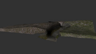

Originally I had wanted the "level end" mesh to have some flowers in its textures. I had to scrap the idea because the textures looked terrible with flowers. It would have been nice, but unfortunately the "plains" remain "plain". 


My glorious "mossy rock" texture. 


I think this was originally modelled by Matt, but Josh did a re-model of it, adding gaps and broken planks. Then I unwrapped and textured.


The "wall". It was fun trying to match the front of it up with the side and top, but it looks okay in game, I guess.


The second "wooden fence", textured. 


Lastly, Matt said he wasn't able to include my Hatchet Man run animation. That was kind of a relief for both of us - getting the weights perfect on the mesh so that the legs didn't intersect was tedious and mostly ineffective. Matt said he needed a wood-chopping animation, so I gave him this:


SPOILERS:
The way I rigged the legs (poorly, that is) means the feet go absolutely crazy with any hip movement (let alone leg movement) - I told Matt he should hide the feet. The audience will never know!

I'm also quite glad I added that extra bone for the axe head. I knew that would come in handy!

Bec - Title Screen Planning

The first two images are the planning pages for the game's title screen. Page 1 shows some concept ideas for the title (with another on Page 2). Yes, I know I mispelled 'Dreamer' four times. That 'A' is very inconspicuous. At this stage I was just using 'Dreamer' as a placeholder before the final title was decided. I didn't want to use a title that gave away the ending of the game or mentioned one of the levels and excluded the other.


Page 2 focuses more on possible designs pathways for the option buttons. We have 3: Start, Exit and Credits.
 
The title letters in solid colour.
 

 Next is a shading and highlighting trial.
 

Title in multiple colours.


 This time the title is white. I originally put within a black shape so I could trial a white coloured version that you could actually SEE but the enclosure turned out looking pretty cool.
 
 The icons for our options on the title screen. Each icon has a background image that's reflected in the game. The Credits icon has an octopus creeping its tentacles out of a wooden chest. I remember Dean making this - or something near enough to it - in Maya which I thought was pretty neat. The Exit icon has a corn cob, with some corn stalks in the background. Corn is a feature of the Plains level. The Start button just has water but I like blue and orange together.
 
 
Two changes from the aboce image: Credits text is written in a style similar to the other two words for consistency's sake; the border for the Exit icon is now completely the one colour (before the border and fill/shape colours were slightly different and this threw me off a little). Although the word Credit might be hard to read against a white background, when it is incorporated into the game it will have a darker background which will allow a viewer to read it more easily.


Bec - More animation

Ferris Wheel for Plains level. Patterns on the inside and bottom of the carts too.


Here's a whale intended to roam the background of the Underwater level. Ot's meant to be blurred and just something to have floating around in the distance. Many thanks to Darren and Matt who helped out with the constraints and how to go about the rig. Actually, now that I mention it I should thank them also for the kelp (which I spent ages on trying to figure out how to attach floating controls to an IK spline rig - only to realise I could achieve the same result solely animating the bones), and the tent which had a problem where one side was invisble depending on where one looks.


Something I played around with in class was a 2D animation of a squid. Originally it was meant to swim around blurred in the background but I found a couple issues with it when I was done. Firstly, it was a 2D asset among 3D ones and this would have stood out. Secondly, the animation is a bit jerky and rough. It was a while since I used Flash and it's not quite so simple to work with. Thirdly, the methods to translate the squid animation into Unity are tedious and I'm not even sure I fully understand some of them. Plus, one of the methods required the animation to come out with a large file aize which is not ideal for a minor background asset for our game.
So here's something I made as a semi-replacement:

A slightly transparent jellyfish. Because why not?


Bec - Contributions ...again. Models.

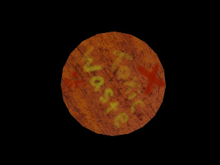
Toxic Barrel, along with Lifejacket, gave me trouble with the UVs. For some reason, I had no idea why, the UVs for these two assests were completely strange and wouldn't register a texture properly, even when the UVs were aligned properly in the editor window. All fixed though. It's just interesting to find how many strange things can happen in Maya. Although I'd probably just attribute this to plain ignorance. ANYWAY...


A Lifesaver. I made this ages ago but it disappeared and so I just forgot about it. I found it again last week in a random folder on my laptop's hardrive. So here it is:

 
Here's a tent for the Plains level too. This is the bare model. No UVs at that point.
 

I got James to kindly do the UVs and texture for the tent while I was working on my other stuff. There were a couple of issues which needed sorting out before being sent into Unity. James came up with a bump map and normal map too.

The pipe, which is meant to be a sludge pipe pumping out toxic stuff. It has a particle effect but I wasn't sure how to make a video or still from Unity to show it in action. So these two pictures will just habe to do.